The time to be mobile friendly is now
Google's April update is now live. Preferential treatment is now given to mobile responsive sites. In this post read about some about some of the first real world results of the change.


In a recent article here on the DMA blog, Not being mobile responsive is about to cost you traffic I wrote about the coming update from Google that see the popular search engine giving preference to mobile friendly websites. Here’s a quick update since their search engine update has been rolled out just last week.
If you’ve not read the original post take a moment to check it out and get up to speed with what this is all about.
“Mobilegeddon” the proof
The SEO industry thrives on updates like this, there’s more than the odd blog post being published by SEO types discussing the change. It even hit main stream media here in Sydney last week.
SearchMetrics published a very good article where they compared a number of high profile websites in the same industry. In each example one is all setup for mobile devices (i.e. it’s responsive) and the other is not. SearchMetrics then looks at the traffic that each site has received before and after Google recent update.
Show me the graphs!
Always a good way to get a point across. Show a graph (we borrowed these screen shots from the original post here).
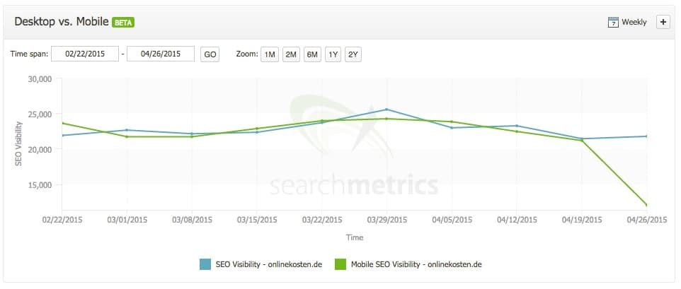
Here is the traffic from a website onlinekosten.de – which is not setup for mobile devices. The green line in the graph shows traffic coming from smartphones and tablet computers.
On the other hand, there’s this website check24.de – which does work well on mobile.
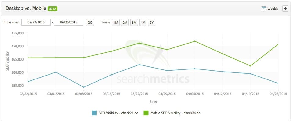
In both cases, it’s the last few days from the 19th April onward that shows you the effect.
If you’d like to jump off and read the full article, here’s the link.
What is interesting in their analysis is this: there’s more to Google’s current change than perhaps we all think. They point to sites that were not optimised for mobile devices but recently have been updated to be responsive. The interesting flow on is that their traffic from Google has increased with the conversion to being responsive – even before this change in Google’s algorithm had been implemented.
Test your site
Chances are that if we built your site in the past 24 months (or probably more) – it’s going to be responsive. If you would like to double check how Google sees it use their Mobile Friendly Test tool. It’s simple, you enter your website’s URL and click Analyze.
Not mobile friendly?
Chat to us we can discuss your options in updating your site so that it does work well on mobile devices.
Reader Interactions