Responsive WordPress Design
We've produced a number of responsive WordPress sites this year, learn why this new approach is so important

Responsive Design is the new buzz-word for 2012, let’s look at what it is all about.
First some background. In December 2011, Jon posted a digital marketing review of 2011, one of the key points in that round up was the amount of mobile traffic received by web sites is on the increase.
The classification of mobile traffic in the Australian Bureau of Statistics review included smart phones, tablet computers and mobile broadband.
Gone are the days when you can build your web site, test it on your computer monitor and be satisfied that you’ve seen what your user is going to see. Chances are that between 25% and 50% of your visitors are going to be arriving on a device other than a traditional computer.
It’s certainly true of some of our client web sites right now.
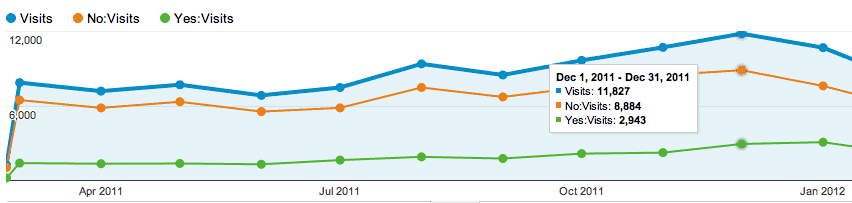
Take a look at this example, stats from a client’s site from February 2011 to February 2012.
The blue is overall traffic, then the green is mobile traffic while the orange is normal PC traffic.
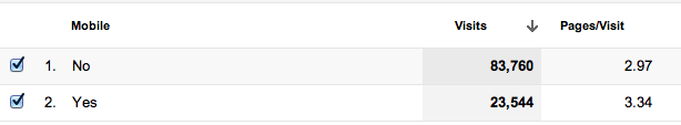
The below chart is of the same period and spells it out in black and white, in 12 months more than 25% of the traffic was mobile.
What does all this mean?
 Well in the words of the Matrix’s Agent Smith, “…that Mr Anderson is the sound of inevitability” – you just have to accept that your visitors are going to viewing your site on something other than a PC.
This is where Responsive Design comes into play. In a nutshell it’s the ability for a design to reconfigure itself to match the browser width of the device that is viewing the site.
So on a PC you can expect the usual kind of layout but as the screen size gets smaller, elements of the site move or even disappear so that the site works on the smaller screen.
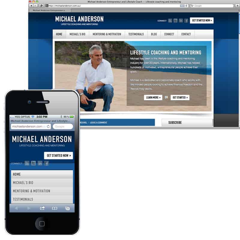 Here’s an example a site we built in January this year, one screen shot is from a normal browser the other an iPhone. The site’s main menu, images and content resize themselves to fit on the smaller screen.
Want to see it for yourself?
Visit MichaelAnderson.com.au on your desktop computer, then visit the same address on your iPad or iPhone.
And all of this done with none other than WordPress – Cool huh?
Reader Interactions