Take a fresh look at Mailchimp (and your eMail marketing!)
Mailchimp has recently updated its tools to provide better support for mobile devices and new tools for the layout eMail content, read on for more details!

Mailchimp has for long time been our weapon of choice to both manage eMail list subscriptions and to actually deliver eMail newsletters. Over the past 12 months the Mailchimp team have done a lot to improve the system, both in interface enhancements and new functionality.
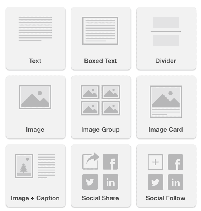
Recently Mailchimp has enhanced its content tools, the editors that you use when putting together an eMail campaign. It now features content blocks that can simply drag into the body of your content and re-organise as required. It’s a lot like Widgets in WordPress!
The screen shot below show just some of the content areas that are available.
New Mailchimp features for everyone?
While these tools are available for all Mailchimp users, your eMail template may not support them. Older Mailchimp templates that are not aware of the functionality may not show these content tools.
This quickest solution is to create a new eMail template for use inside your Mailchimp account. If you’re a DMA client and need help with this contact us discuss an upgraded template.
Think: mobile first for your eMail newsletters
There’s another good reason to take a look at your eMail template: how does it look on a mobile or tablet device?
I’ve been paying a lot of attention to this since the start of 2014. For a number of clients we’ve already done redesigns of Mailchimp templates to simplify them and ensure that they look great on mobile.
Why?
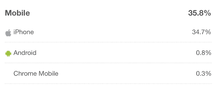
Just look at the stats and it’s obvious.
This is from the DMA Mailchimp list (our clients). 35% of people open the eMail on a mobile device. Some clients that I’ve worked with recently have mobile opens that are over 50% – there is a definite trend, more users are looking at eMail on smart phones and tablets. So it’s our job to ensure that the content looks great on these devices.
When building websites, we’ve been focusing on responsive WordPress designs for over 2 years now. Mailchimp with its new templates features now also let’s you design specifically for mobile viewing. Simple things like increasing the font size on small screens and removing overly complex layouts (read: one main content column without sidebars) are now possible.
See for yourself: check out your Mailchimp list statistics
Login to your Mailchimp account and see what your users are doing.
From the main dashboard, select Lists from the main menu. When Mailchimp displays all of your lists there is a grey button Stats on the right hand side of the screen. Click that and you’ll see a variety of statistics about your list, down the bottom however look for the heading “Top eMail Clients” – that’s where you will see the information on mobile versus desktop.
I’ve love to hear about other people’s stats, leave a comment below with the percentage of mobile users on your lists!
Reader Interactions