

It’s true, the web browser wars of the late 90’s are over but it doesn’t mean as a web developer or a web site owner that it is time to be complacent. When said ‘wars’ were still running hot it was hard work for web developers. Trying to make your site look good in Internet Explorer and Netscape was like dressing Hulk Hogan and Paris Hilton in the same clothes and expecting both to look hot.
The modern web browsers certainly do a better job at conforming to standards, and rendering sites to those standards, but you’d be surprised still how different the exact same web site can look through different browsers.
So as a web site owner, you really should take the time to ensure that your site looks acceptable in at least the most popular browsers.
So how should you test your web site?
I think it is pretty easy these days to test your site in a number of browsers regardless of what operating system (Mac, Windows, Linux etc..) you are using.
Below is a graph of browsers that people have used in the past month to access one of our sites. This gives you a good overview of where to start.
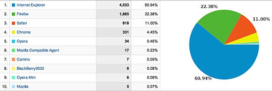
I would recommend that you start at the top and work your way down. If you run Windows, you’ll have Internet Explorer (make sure you’ve upgraded from version 6 – it’s not something you want to be using), so then it’s a matter of installing a couple of the others.
Mac users, you will have Safari, again though it is trivial to install Firefox, Google Chrome and Opera – they are all free (see links at the bottom of this post to the individual downloads).
Internet Explorer is going to be a little more tricky, you may already be running Bootcamp that allows you to run Windows on your Mac. Alternatively try some virtual machine software that will allow you to run Windows from inside your Mac OS X system. VirtualBox from Sun is probably a good place to start, again it free.
Once you’ve got a variety of browsers installed (aim for Internet Explorer, Firefox, Safari and Google Chrome) it is then a matter of viewing your site in each one, looking for strange behaviour.
It’s worth noting, you’re not going to get a site to look exactly the same in each browser, what you’re aiming to do is to have the site display in each without wonky columns or massive fonts from nowhere, things like that!
One more thing: don’t forget smart phones and mobiles
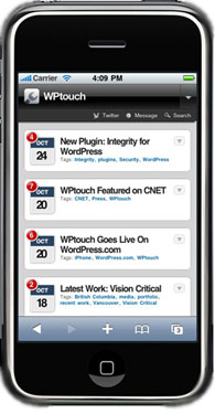
If your site is built on WordPress there is a great plugin called WPTouch, it will detect when someone is viewing your site with an iPhone and render the site specifically for them. It takes the whole “what will my site look like on an iPhone” problem and solves it in a snap!
Talk to us if you’d like us to configure this great plugin for your WordPress site.
Happy testing, I hope you don’t find too many problems when you start to look at your site through different eyes!
Links to browsers